Uncategorized

The Pros Share Their Favorite 15 ‘Peacock Blue” Paint Colors

[siteorigin_widget class=”SiteOrigin_Widget_Image_Widget”][/siteorigin_widget]
Have you ever wanted had to choose paint colors for your home and wished you could to dial up a professional designer and ask what their favorite color is what you are trying to pick out?  
 
Here’s the next best thing!  I’m going to poll my designer friends each week for their favorite “go to” colors across the color spectrum.  Let’s start with one of the hottest colors right now, Peacock Blue.   Peacock blue can range from soft blue to deep, bold blue and everything in between. 
[siteorigin_widget class=”SiteOrigin_Widget_Image_Widget”][/siteorigin_widget]
Click Here to see the Pro’s Picks for Peacock Blue…..


Here are the top Peacock Blue Paint Picks from the Pros:
 
1. Krista Nye Schwartz of Cloth & Kind – 
Farrow & Ball – Hague Blue no. 30
[siteorigin_widget class=”SiteOrigin_Widget_Image_Widget”][/siteorigin_widget]
[siteorigin_widget class=”SiteOrigin_Widget_Image_Widget”][/siteorigin_widget]
“I wanted the closet to have a soulfulness and comfort; Hague Blue was the perfect choice for this little jewel box closet ” ~ Krista Nye Schwartz
 
 
2.Erika Ward of Erika Ward Interiors –
  Benjamin Moore Dark Harbor #CSP-720
[siteorigin_widget class=”SiteOrigin_Widget_Image_Widget”][/siteorigin_widget]

Benjamin Moore “Dark Harbor” CSP-720

[siteorigin_widget class=”SiteOrigin_Widget_Image_Widget”][/siteorigin_widget]
“Dark Harbor creats a dramatic, sophisticated 
the backdrop for a bedroom.”
-Erika Ward
 
3. Leah Ansel of Leah Ansel Interiors – 
Benjamin Moore “Salzburg Blue.”
[siteorigin_widget class=”SiteOrigin_Widget_Image_Widget”][/siteorigin_widget]
Benjamin Moore #755 Salzburg Blue
 
“My favorite peacock blue is Salzburg Blue, it is magically vibrant and soft at the same time.  Such a perfect backdrop for any artwork.  It makes other colors pop!  It’s a color that makes me feel warm and fuzzy! “
  ~Leah Ansel
 
Leah also loves the following two peacock blue colors:
[siteorigin_widget class=”SiteOrigin_Widget_Image_Widget”][/siteorigin_widget]

4. Benjamin Moore Varsity Blue #756

[siteorigin_widget class=”SiteOrigin_Widget_Image_Widget”][/siteorigin_widget]

 Benjamin Moore “Varsity Blue” #756

[siteorigin_widget class=”SiteOrigin_Widget_Image_Widget”][/siteorigin_widget]

5. Benjamin Moore “Venezuelan Seas”  2054-30

[siteorigin_widget class=”SiteOrigin_Widget_Image_Widget”][/siteorigin_widget]
Benjamin Moore Venezuelan Sea #2054-30


6. Laurel Bern of Laurel Bern Interiors –  
 
Benjamin Moore “Naples Blue”  #2057-30 
[siteorigin_widget class=”SiteOrigin_Widget_Image_Widget”][/siteorigin_widget]
Benjamin Moore “Naples Blue” 2057-30
 

                                      “It’s beautiful in small spaces,

                                            like in a small country

kitchen and has enough warmth to
 look fabulous in a low light or north facing room”.
~Laurel Bern 
 
7. Robin Siegerman of Renovation Bootcamp :
Benjamin Moore “Twilight” 2058-10
[siteorigin_widget class=”SiteOrigin_Widget_Image_Widget”][/siteorigin_widget]
[siteorigin_widget class=”SiteOrigin_Widget_Image_Widget”][/siteorigin_widget]
“I pick Twilight because ” it looks much deeper on the fan deck than it does on a wall.  When it’s applied, it has a quiet vibrancy, that isn’t 
apparent on the chip”. ~ Robin Siegerman
 
 
8. Jana Rae – Sherwin-Williams #SW0064 “Blue Peacock”
[siteorigin_widget class=”SiteOrigin_Widget_Image_Widget”][/siteorigin_widget]
[siteorigin_widget class=”SiteOrigin_Widget_Image_Widget”][/siteorigin_widget]
I like Blue Peacock “because it’s one of those colors that’s bold and dramatic but not over the top.  It will make a statement whether it’s an entire room painted in it or just a single painted wood chair.  Just like in nature it can be easily paired with neutrals or more bold pops of color like purple or lime green”. ~Jana Rae
 
Jana also likes Sherwin Williams SW6769 “Maxi Teal
[siteorigin_widget class=”SiteOrigin_Widget_Image_Widget”][/siteorigin_widget]
9. Natalie Sewell Reddell of Natalie Reddell Interiors aka
“Commander in Chic” – Sherwin Williams SW6789 Blue Mosque
[siteorigin_widget class=”SiteOrigin_Widget_Image_Widget”][/siteorigin_widget]
[siteorigin_widget class=”SiteOrigin_Widget_Image_Widget”][/siteorigin_widget]
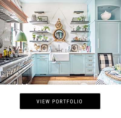
Photo Credit to Jami Carlton
This is a photo of Natalie’s dining room, which she says is her husband’s favorite color in their house.  
 
 
10. Peggy Platner of Platner & Co. Interior Design of Malibu –
Farrow & Ball – Lulworth Blue NO. 89
[siteorigin_widget class=”SiteOrigin_Widget_Image_Widget”][/siteorigin_widget]
“I prefer Farrow & Ball’s Lulworth Blue, as their recipes have a much higher pigment content than other brands which creates a visibly greater depth.  In choosing colors, we always follow natures lead.  A peacock offers so much vibrant inspiration for a room.  Beautiful hues of blue that create the mood, depth and contrast.” ~Peggy Platner & Co.
 
11. Ruthie Staalsen of DecRenew Interiors – 
Sherwin Williams “Gulf Stream” SW6768
[siteorigin_widget class=”SiteOrigin_Widget_Image_Widget”][/siteorigin_widget]
[siteorigin_widget class=”SiteOrigin_Widget_Image_Widget”][/siteorigin_widget]
My favorite “peacock” color is Sherwin Williams Gulf Stream SW6768 shown on the chair in the photo above.  This chair was in one of our kitchens that was featured in Traditional Home Magazines special edition “Great Kitchens” May 2013.  Fabulous Color!!! ~ Ruthie Staalsen
 
 
12. Kelly Rogers of Kelly Rogers Interiors 
 
 Benjamin Moore “Fair Isle Blue” #CSP-715
[siteorigin_widget class=”SiteOrigin_Widget_Image_Widget”][/siteorigin_widget]
[siteorigin_widget class=”SiteOrigin_Widget_Image_Widget”][/siteorigin_widget]
Fair Isle Blue in a bathroom of client of Kelly Grant Rogers
 
13. Catherine Avery of Resovate –
Benjamin Moore “Bahaman Sea Blue.” 2055-40
[siteorigin_widget class=”SiteOrigin_Widget_Image_Widget”][/siteorigin_widget]
[siteorigin_widget class=”SiteOrigin_Widget_Image_Widget”][/siteorigin_widget]
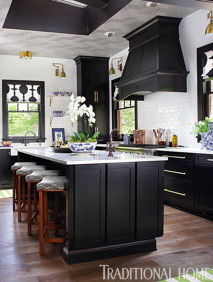
Photo via www.arena-salon.com
“We recently painted a travel agency Bahaman Blue.  The client is all about traveling to Africa and other exotic destinations.  Her office design reflected this.  It is also the color in her logo”. ~Catherine Avery
 
 
14. Amy Wax of Color 911
 
Sherwin Williams “Tantilizing Teal” SW6937
[siteorigin_widget class=”SiteOrigin_Widget_Image_Widget”][/siteorigin_widget]
[siteorigin_widget class=”SiteOrigin_Widget_Image_Widget”][/siteorigin_widget]
[siteorigin_widget class=”SiteOrigin_Widget_Image_Widget”][/siteorigin_widget]
Did you notice the range of colors from the designers which all 

fall into the range of peacock blue?


This post reveals how differently everyone views color or thinks of a 

specific color.  Yet another reason why it is vitally important to work with 

professional when it comes to picking paint colors.  Clear 

communication is key and vital to achieving proper results! 

Collect pictures out of magazines, start a Pinterest 

Paint Board, Find a Fabric or shopping bag the color you want to use.   

Small paint chips can be so deceiving.  The designers know how it will 

look on the wall given the light in the room or the reflections from other 

finishes.    

Tip:  I always recommend painting large poster board samples 

to pin around the room, you plan to paint so you can look at the color at 

various times of day in various degree of light.  


_________________


Thank you to my designer friends who were willing to share their favorite
 
peacock blues today!  Which is your favorite?  If you decide to paint a 
 
room in one of these colors please let me know by posting a picture on 
 
my Lisa Mende Design Facebook wall!
 
 
Tune in Next Tuesday when our Pros share their Picks for 
 
Favorite Black Interior Paint!
[siteorigin_widget class=”SiteOrigin_Widget_Image_Widget”][/siteorigin_widget]

Leave a Reply