[siteorigin_widget class=”SiteOrigin_Widget_Image_Widget”][/siteorigin_widget]
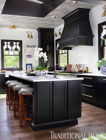
It’s back to the kitchen update at the show house sponsored by Traditional Home Magazine and High Point Junior League. This week I worked on the color palette for the room. I had a vision for the space the first day I toured the house, but I kept questioning whether I wanted to go with another idea. It’s funny how that happens. I feel like houses have souls like people. When I enter a house, I look for clues to help me decide the design direction I will choose. This house felt very masculine to me. I am not sure if it was because I knew the last person who lived in the home was a single man with his seven dogs, but it felt masculine. I kept playing with various color palettes but kept going back to my original thoughts. Here are a couple of fabrics and wallpapers I considered.
Keep reading….
[siteorigin_widget class=”SiteOrigin_Widget_Image_Widget”][/siteorigin_widget]
My Romo representative, Suzanne Early came by with new books, so of course my ears perked up when she mentioned new product offerings. I love the strong geometric patterned fabric in the fresh green with grey accent. It would be a great fabric to make into roman shades for the kitchen windows. The wallpaper could be perfect for the walls of the breakfast room. Hmmmm….
[siteorigin_widget class=”SiteOrigin_Widget_Image_Widget”][/siteorigin_widget]
Perhaps the citron and blue grey colorway would be more interesting? What do you think? Which color story do you prefer? After looking at the walls in the breakfast room which are chopped up because of two doors, a window, and the proposed breakfast center, I wasn’t convinced I needed a wallpaper with a pattern. The thought of an interesting wallpaper is always tempting, but you must look at the room and decide if it will work to achieve the look you are envisioning. In this case, I decided it wasn’t worth it.
[siteorigin_widget class=”SiteOrigin_Widget_Image_Widget”][/siteorigin_widget]
Here’s a view of that area. All the cabinetry has been removed, but a new built-in will be rebuilt on the left side on the other side of the beam (that is no longer paneled nor that low.) The wallpaper would not have an opportunity to a make much of a statement.
[siteorigin_widget class=”SiteOrigin_Widget_Image_Widget”][/siteorigin_widget]
And here is the other side of the kitchen…least you forget!
I’m getting excited about this project! I will let you in on a little secret! I didn’t choose either of those fabrics above, but I did decide whose fabric I plan to use! More on that next week. I think you will approve. This is going to be one heck of a before and after! Don’t we all love a good before and after? I know I do!
I leave tomorrow for Frankfurt with Blogtour Ambiente so I must go pack! I still have so much to do! Make sure you follow me on all my social media channels especially instagram at lisamendedesign, to have a sneak peek into my trip! It’s going to be so much fun! I can hardly wait! We are having dinner with royalty one night! Yikes! I’d better brush up on my curtsy!
Happy Tuesday!
[siteorigin_widget class=”SiteOrigin_Widget_Image_Widget”][/siteorigin_widget]
