[siteorigin_widget class=”SiteOrigin_Widget_Image_Widget”][/siteorigin_widget]
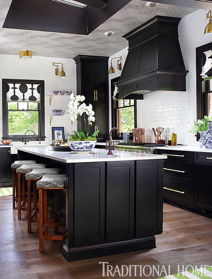
Remember this black and white kitchen I designed for the Traditional Home Showhouse in High Point? It was published in Traditional Home Magazine, and since that time, I have been told by designers across the country that clients tore it out of the magazine and brought it as the inspiration for their “new” kitchen project. I must admit, it is one of my all time favorite kitchens I have designed. Since it was a show house, I was able to have “free reign” in design. Which brings me to why I am writing this blog post.
Often when clients hire designers they try to control the process. It is strange to me as to why anyone would do this, so I decided to write a blog post and explain why it is important to hire your designer carefully and then trust them to do what is right for your project. It isn’t because we are trying to spend the most money possible. In fact, it is often the opposite.
Click Here to see more and find out my thoughts on working with a designer….
Click Here to see more and find out my thoughts on working with a designer….
Designers are like artists. Our canvas is your home. When we have a vision for a room, it is a complete thought, not a micro focus on one object at a time. Yes, designers may hyper focus on each minute detail in a room, but more importantly, we focus on how those elements relate to the other items in the room which are not something the client can always see.
Take the kitchen above for example. Who would ever think this kitchen was designed to play up ceiling height and make an ugly skylight look as though it was part of the original design? Let’s look at the original pictures so you can get an idea of what this kitchen was like the day I went to see it.
Before:
[siteorigin_widget class=”SiteOrigin_Widget_Image_Widget”][/siteorigin_widget]
This is the skylight on the ceiling. It was not a great feature other than it allows fabulous light into the kitchen. To remove it would cost a fortune, so I decided to make it part of the design so it would disappear.
After:
[siteorigin_widget class=”SiteOrigin_Widget_Image_Widget”][/siteorigin_widget]
I had the ceiling papered in Cole & Son Labyrinth and painted the inside of the skylight black. Instantly, the skylight was more interesting and less 70’s. Can you see how painting the inside of the skylight black marries it with the cabinetry and connects the space? Adding the patterned wallpaper on the ceiling further connects the ceiling and makes it an integral part of the design of the space.
Let’s take a look at the next obstacle in this kitchen.
There was a paneled header that separated the kitchen from the breakfast room. It divided the space visually and functionally. The header was only about 6 ft from the floor, so anyone over 6 ft tall had to duck to walk under it. We retained a structural engineer who told us we could remove this and replace it with an i-beam which would raise the opening to a better height. Once the paneling was removed, and the beam was in place we were able to do away with the dividing wall which expanded the ceiling and make the kitchen and breakfast room feel more like one large open room. Ahhh…so much better!
Before:
[siteorigin_widget class=”SiteOrigin_Widget_Image_Widget”][/siteorigin_widget]
[siteorigin_widget class=”SiteOrigin_Widget_Image_Widget”][/siteorigin_widget]
[siteorigin_widget class=”SiteOrigin_Widget_Image_Widget”][/siteorigin_widget]
[siteorigin_widget class=”SiteOrigin_Widget_Image_Widget”][/siteorigin_widget]
[siteorigin_widget class=”SiteOrigin_Widget_Image_Widget”][/siteorigin_widget]
What a difference raising that doorway made to the overall space.
I opted to paint the trim in the breakfast room black to unify the two spaces.
View from the breakfast room into the kitchen
Before:
[siteorigin_widget class=”SiteOrigin_Widget_Image_Widget”][/siteorigin_widget]
[siteorigin_widget class=”SiteOrigin_Widget_Image_Widget”][/siteorigin_widget]
Notice how the cabinets in the before did not go to the ceiling and in the after they do? I took the cabinets to the ceiling in an effort to connect the ceiling and make it feel more intentional.
[siteorigin_widget class=”SiteOrigin_Widget_Image_Widget”][/siteorigin_widget]
[siteorigin_widget class=”SiteOrigin_Widget_Image_Widget”][/siteorigin_widget]
[siteorigin_widget class=”SiteOrigin_Widget_Image_Widget”][/siteorigin_widget]
I wish I had taken exactly the same angle in the after as the before but hopefully, you can get the gist of what I did. Rather than have the cabinets butt up to the window which made the window look small and crowded, I back the cabinets off of the window and created open shelving which expanded the window and made the wall more interesting while creating space for objects that are readily available as needed. Tiling the wall the window is on makes the wall have more prominence as well and connects it to the ceiling by forcing the eye upwards.
Before:
[siteorigin_widget class=”SiteOrigin_Widget_Image_Widget”][/siteorigin_widget]
[siteorigin_widget class=”SiteOrigin_Widget_Image_Widget”][/siteorigin_widget]
In the before photo above, the refrigerator was the first thing one saw when entering the back door. I wanted to create a better focal point as you enter the kitchen, so I made the range the focal point with the handsome hood. Also, notice how I expanded the island and created seating for five.
Before:
[siteorigin_widget class=”SiteOrigin_Widget_Image_Widget”][/siteorigin_widget]
[siteorigin_widget class=”SiteOrigin_Widget_Image_Widget”][/siteorigin_widget]
I rearranged the kitchen to create a statement wall with the beautiful Thermador appliances. The refrigerator, wine frig and beverage center
take center stage on this wall.
Before:
[siteorigin_widget class=”SiteOrigin_Widget_Image_Widget”][/siteorigin_widget]
[siteorigin_widget class=”SiteOrigin_Widget_Image_Widget”][/siteorigin_widget]
Removing the cabinetry allowed room for a proper breakfast room.
So what do you think? Can you believe it is the same space?
Ok, so let’s talk a little more about why clients should listen to their designers.
Do Your Homework When Hiring A Designer.
1) Make sure the work in their portfolio aligns with your style and your vision for your project.
2) Check out your designer’s credentials and affiliations.
3)If you are doing a kitchen or bath remodel, does your designer have expertise in these areas?
4) Check out their reviews – see if they have worked well with clients
5) Is the designer available to meet your time frame?
6) Meet with the designer to allow each of you to decide if your personalities mesh. This is important as you will be spending lots of time together.
7 ) Does your budget fit with your designer’s pricing?
8) Ask the designer how they present their projects. If you are someone who needs to see design boards, make sure this designer presents design boards.
9) Discuss billing and make sure you can work with how the designer bills.
10) Make a list of your needs and desires for your project. Tear out pictures from magazines as inspiration for your project for your designer.
Why You Should Trust Your Designer’s Vision for Your Project
1) You hired the designer because you liked their portfolio or work they have done that you have seen.
2) The designer knows where to spend the money for the most impact in your project and where to save.
3) The designer has a black book of the best tradesmen and craftsmen available and knows how to direct them.
4) The designer spends many hours at market and industry events and knows the latest and greatest in design options available.
5) The designer is experienced. This isn’t their first rodeo.
6) The designer knows what is right for your house. Just because your neighbor used Spanish white on her cabinets doesn’t mean that is the right white for you. The lighting in your home may cast shadows that make the paint look differently.
7) Designers have relationships that you don’t have. If you order something off the internet and it comes in broken, it is your problem and often companies don’t care.
8) The designer knows at what point each item is needed, and they plan for the items to arrive on time. If your contractor is ready for your sconce and they aren’t there, it holds up construction and time is money.
9) The designer has a vision for your room.
10) Remember You are not a designer. Always defer to the designer.
11) If you don’t feel you can defer to your designer you need to re-evaluate your decision of hiring your designer and discuss with them.
12) Enjoy the process. Always interject your thoughts and give the designer to embrace them or tell you why they aren’t what you need.
We want happy clients! That is our goal! We want your home to be about you, not about us but we want it to be well designed.
In the end, do your homework in the beginning and hire the designer you think will carry out your vision for your home then trust them to do so.
Happy New Year! If you need a designer, we are currently booking in March, so contact us at lisamendedesign@gmail.com to get on our schedule.
[siteorigin_widget class=”SiteOrigin_Widget_Image_Widget”][/siteorigin_widget]


