“Our Trader of spices and glittering silks arrives back to his hideaway on a rainy Autumn London day. His cloak and hat hang, and his bedroom is a treasure chest of souvenirs from his travels to market places in the Orient. The spice colours of the East and the dappled light of an early Autumn day create a glowing scene. The chandelier of a glittering galleon above the bed reminds him of travels of the past and those to come in the future.” [continue reading after the break…]
Kemp was asked to design the entrance of the show. Her work was divided into two areas flanking the main entrance to the show. To the right, she designed a bedroom, and to the left, a courtyard with a bath area. Both areas were draped with simply constructed Jim ThompsonFox Linton silk shades in bright pink, mustard and orange accented in Dedar black and white stripe trim which made you feel like you were peeping into someone’s private spaces. The bedroom was a menagerie of color and texture. Kit serves as Design Director for theFirmdale Hotels of London and NYC, which she co-owns with her husband, Tim. As director of this boutique hotel group, Kit is adapt in creating beautiful, yet functional spaces filled with detail to delight the most meticulous guest. The Decorex spaces did not fall short in this concept. Everything was tailored made and exquisitely executed. There was a perfect balance of masculine and feminine, rustic and elegant. Each piece in each area was a study in intricate details. I had to concentrate each piece to take it all in. It was the perfect example of a well designed collected look that would keep the viewer guessing, as to whether it was recently crafted or done over time. As I post these photos, I see things I didn’t notice in the spaces while at the show. The balance in pattern, scale and color were achieved to perfection.
The grouping of PET lamps created an art installation in the room. The variety of shape color and texture was delightful and immediately drew your eye into the space.
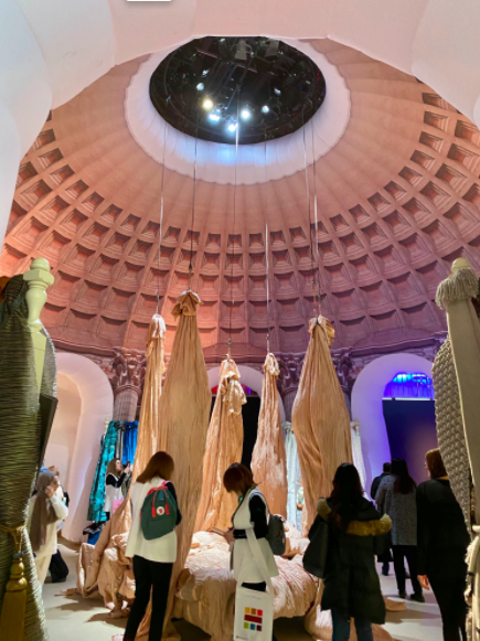
The walls were upholstered in Kit Kemp Bespoke from Christopher Farr Cloth. If the PET lamp installation wasn’t enough, the loom installation over the bed created by Hermione Sky O’Hea further enhanced the feeling of wrapping oneself inside a cocoon.
The sofa was from
Appliquéd leaf artistry on the pillows and headboard was created by Pippa Caley. As can be seen in this close up of the detail some of the appliquéd leaves where made to look as though they just fallen on the fabric.
Amazing detail in the appliqué work
The space was put together like a well organized puzzle, making use of every inch of space, to visually delight the viewer. The beautiful timber flooring was Schotten & Hansongerman antique flooring. The delicate scandinavian planks were fused with English tradition, to create the perfect floor for the space.
The space was put together like a well organized puzzle, making use of every inch of space, to visually delight the viewer. The beautiful timber flooring was Schotten & Hansongerman antique flooring. The delicate scandinavian planks were fused with English tradition, to create the perfect floor for the space.
The small striped sofa provide the perfect amount of boudoir seating. It was custom made byBen Whistler, of London. This company makes custom pieces for everything from luxuryresidential projects to large hotel contracts.
Capital Carpets of Chelsea custom made the rug
which repeated the leaf theme in the room, but in a more
abstract,manner which added to the playful feel of the room.
All soft furnishing were by Jenny Morgan
The small mustard ikat pillows on the bed were bedazzled
with gold beaded trim. Embroidered linens by
Jab Anstoetz (Soliel Blue) and the bedspread is
Lelievre (Jean Paul Gaultier)
The beautiful ceramic lamps bedside are
from Richard Taylor Designs
Detail shot of the cameos on the drawer fronts of the
shell encrusted bedside chest by Chelsea Textiles
Whether a bedroom has a fabulous view or not, Kit’s design demonstrates how to remedy the issue. Can you imagine walking up to this color? Cape next to the bookcase is by
Christine Vanderhurd
The beautiful ebonised French bookcase from
Brownrigg is filled with colorful china.
The beautiful ebonised French bookcase from
Brownrigg is filled with colorful china.
Kemp paid attention to detail by making sure the backs of the chairs were as interesting as the front, since the backs faced
the entrance to the building. Here is an armchair by Alma which featured a band of yellow leather with pretty cutouts which kept the otherwise simple chair from being boring .
This little guy was dressed in boiled grey boiled wool from Holland & Sherry on the front and had a patterned fabric back with gold piping and nail heads, which made this little tub chair a standout.
To the left of the entrance was the courtyard created by Kemp.
The walls in the main area were papered in an oversized botanical paper by Kit Kemp Bespoke and were trimmed in Farrow & Ball “Arsenic” paint.
The main wall was a anchored by driftwood table by The Decorator Source and over it hung an antiqued glass art deco mirror by Rupert Bevan. On the left side of the console was a camel table by Soane and on the right was a chair covered in a bright stripe fabric that looks akin to a kilim rug. Front and center in the space was a beautiful English antique octagonal table with turned leg and egg and dart trim along the base.
Up close of the Driftwood console by The Decorator Source
Camel side table by Soane
The sculpture “Connected” by
Tom Stodgon further enhanced the zen feel of the
bathroom area and added a contemporary balance
to the otherwise traditional space. The bath accessories
were from Balineum, and bath linens were from
Volga Linen.
All in all, I Kit Kemp’s well designed entrance was my favorite exhibit at Decorex International. She took the theme of the show “Silk Routes” and created a bedroom and courtyard area, that provided a sense of history, yet a bit of fantasy mixed with asian zen and hints of Marrakesh. The end results were two beautiful curated spaces that felt livable and collected over time. Kit said she likes to create interiors that make you smile and she definitely achieved that with me.
To learn more about Kit Kemp and see more of her work, visit the Firmdale Hotels or watch the video here.
To learn more about Kit Kemp and see more of her work, visit the Firmdale Hotels or watch the video here.
If you are as crazy for Kit Kemp as I am you can
order her book Kit Kemp, A Living Space, here. It is filled with page after page of delicious design done the Kemp way.
Hope you enjoyed getting to know Kit Kemp if you weren’t familiar with her already. Did she make you smile?
————————–
Thank you to the wonderful sponsors of Blogtour London!

 By
By